
Client: California State University, Chico (commonly known as Chico State), a University with approximately 17,000 students in Chico, CA. More specifically, my client was Chico State’s graduating Class of 2020.
Duration: I was selected for this project in September 2019, with the final logo required by January 2020 for marketing purposes, with the shirt being sold to the senior class in April 2020. So, I had a little over 3 months to complete my design, after which I was a part of the marketing and development team.
Objective: To create a logo for Chico State’s Class of 2020. This design needed to be dynamic, eye-catching, and easy for every graduate to resonate with and enjoy – regardless of age, gender, interests, etc. Another requirement for my design was for it to be all one color, with no shading, so that it could be printed as a solid white logo on red t-shirts.

Background: Every year, Chico State’s graduating seniors have a t-shirt designed for them with their year of graduation and any other design elements that the student designer sees fit. For 2020, I was selected as one of two designers for this project. We each created a logo for the t-shirt, and the senior class voted to choose the winner, which ended up being my design. This design is used to celebrate the achievements of my fellow graduates and to commemorate our time in college. In addition, I also created a version which says “Alumni” rather than “Class of 2020”, to be used for promotional materials for Chico State Alumni.
Research: My research process consisted mainly of looking through logos which had been used for past graduation t-shirts and noticing what I liked about them, what made them successful, and where my logo could be more successful. I also reflected on what Chico State means to me and what characteristics and I would want my graduation logo to possess.
Strategy: Starting out, my sketches were very simple and all over the map; I spent a few days sketching out any and all ideas that came into my head, including everything from our University mascot to a stylized version of our iconic Trinity Hall, which is the idea I eventually settled on. After I had sketched out multiple pages of ideas, I ran them all by my team and got feedback. With this feedback and my own visions, I decided upon the sketch that I wanted to pursue, and took it into Illustrator to create a more fleshed-out digital sketch. After that, I began the iterative process of creating drafts, getting critiques, and chipping away at imperfections bit by bit. I also had to keep in mind all of the future applications of my logo: from large t-shirts to tiny pins, and with both “Class of 2020” and “Alumni” text, my logo had to be flexible and usable for all.
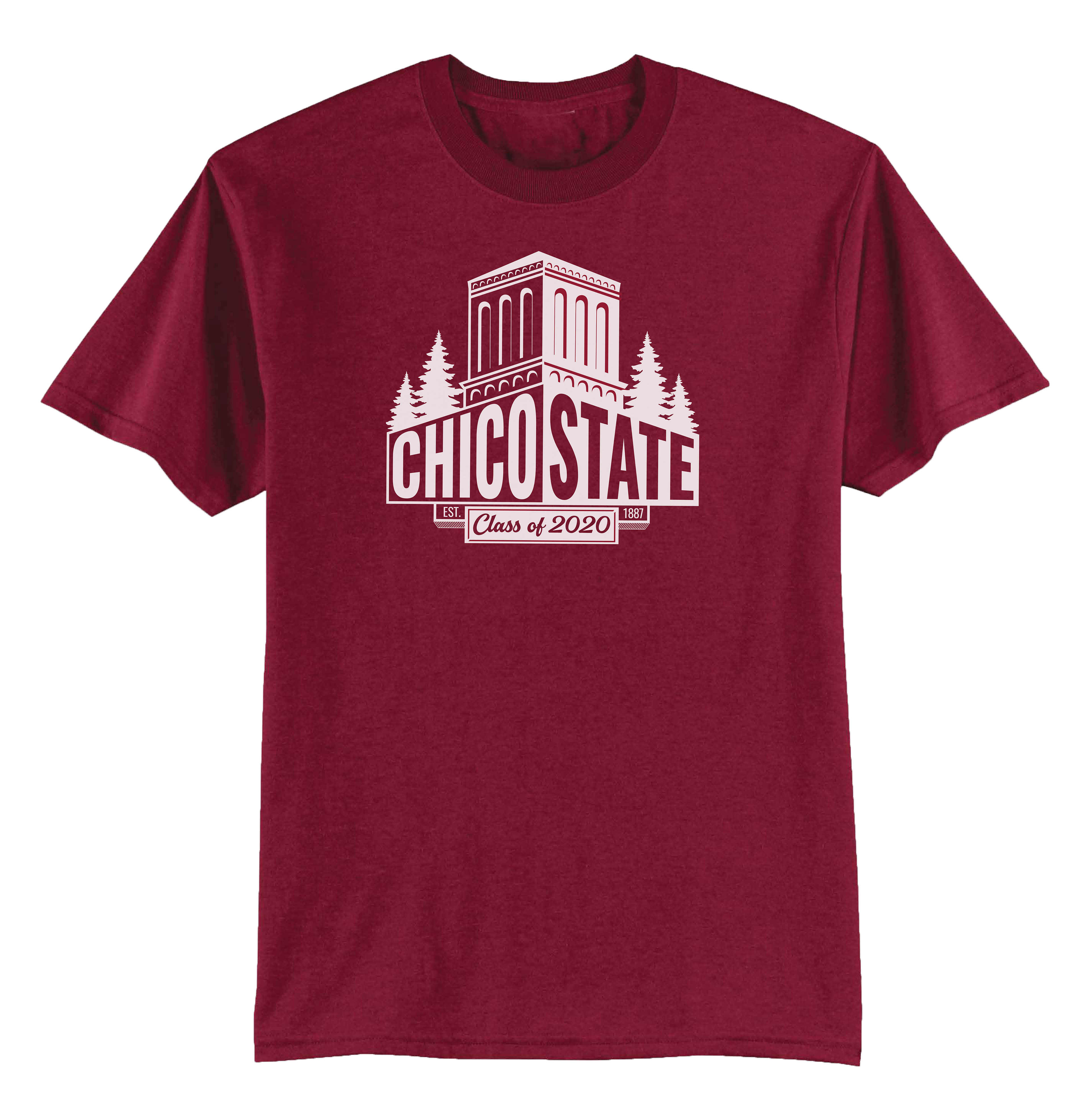
Design Solution: Following my original sketched idea and evolving it as I gained insight, I created what you see above. My main priorities in this design were clarity, strength, and attention to detail. Every architectural slope, every curve of a tree branch, and every edge of each letter were carefully tweaked and edited until they achieved my desired appearance. I also wanted my logo to be able to evoke feelings of pride and love for our University when my fellow graduates looked at it. Keeping in mind the applications of my logo, I ensured that my design could easily be scaled and stay effective.
Challenges: As previously stated, taking the size and version of future applications into consideration made it more challenging to create a logo. In addition, having countless concurrent projects from my office and college classes, time management was a must. Overall, this process was very challenging and rewarding as well. I learned a lot of skills and tools along the way, and it’s been my most satisfying project to this day.