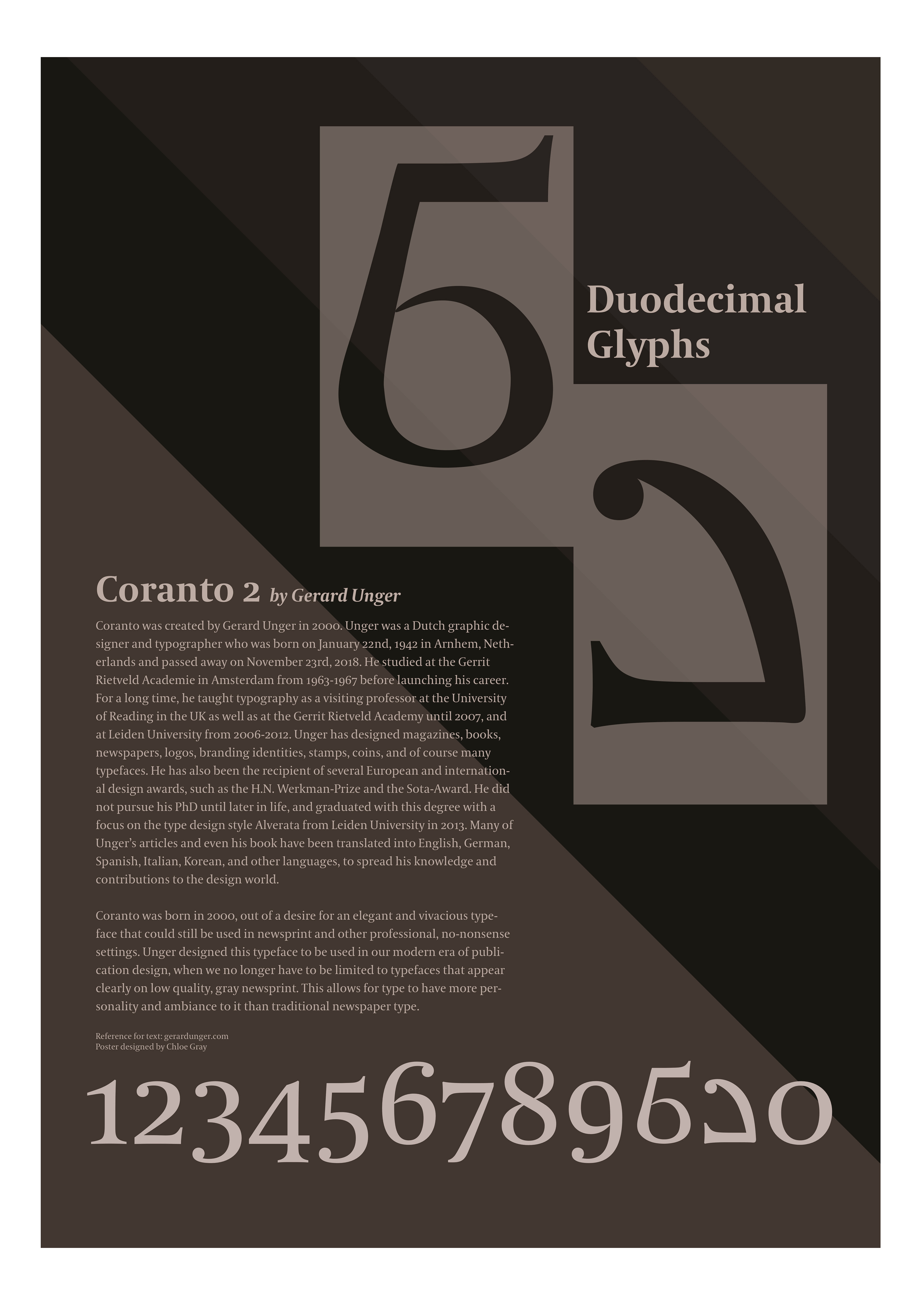
OBJECTIVE: Design two new glyphs for the typeface Coranto 2, which represent the numbers 10 & 11. Following this, to create a poster which showcases these glyphs and how they fit into the rest of Coranto 2’s glyphs.
Glyphs
Poster
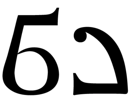
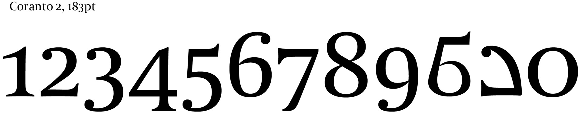
STRATEGY: Since I wanted my newly-created glyphs to fit into the overall typeface of Coranto 2, I took my time when crafting drafts of possible glyphs. I was careful to balance the complexity, size, weight, and contrast of my glyphs so that they would fit into the typeface seamlessly and appear as if they could have been designed by Gerard Unger himself. My “10” features elements from Coranto 2’s original “2”, “5”, “6”, and “7”, blended together using the pen and smooth tools to join the pieces and fit them together in a natural and believable way. My “11” was made using the same mindset and tools, this time with elements from Coranto 2’s “2”, “3”, and “7”. When creating a poster around this glyph set, I wanted to keep the color palette, design elements, and overall voice all appropriate for the font itself. Since this is a very well-respected and steadfast font, I decided against any bright colors and instead went for a muted, monochromatic neutral palette. In order to highlight my newly-created glyphs without being loud or dramatic, I created background boxes with dimensions that mimic text boxes one may see when typing or designing.
PROGRAMS: Adobe Illustrator
Click on any image for a larger view