Duration: This project was completed in the Fall 2019 semester, with approximately 3 months to design the book, print the pages and covers, and go through the entire process to put the book together into a finished project.
Objective: To select a book that had been banned at some point in history, and to create our own edition of it that highlights the reason why it was banned, or why it holds meaning to us. After selecting and designing our book, we learned how to go through the printing and binding processes to create a completely handbound edition of our book.
Background: For my project, I knew that I wanted to choose a book that had been banned for an issue that still had relevance in modern society. This was because my hope was to relate the text I chose to modern issues and show how over the course of several decades, similar taboos and issues persist, even with change in legislation, societal values, or other relevant cultural changes. So, after looking into a few books banned for racial, gender-based, or LGBT content, I decided upon The Picture of Dorian Gray by Oscar Wilde.
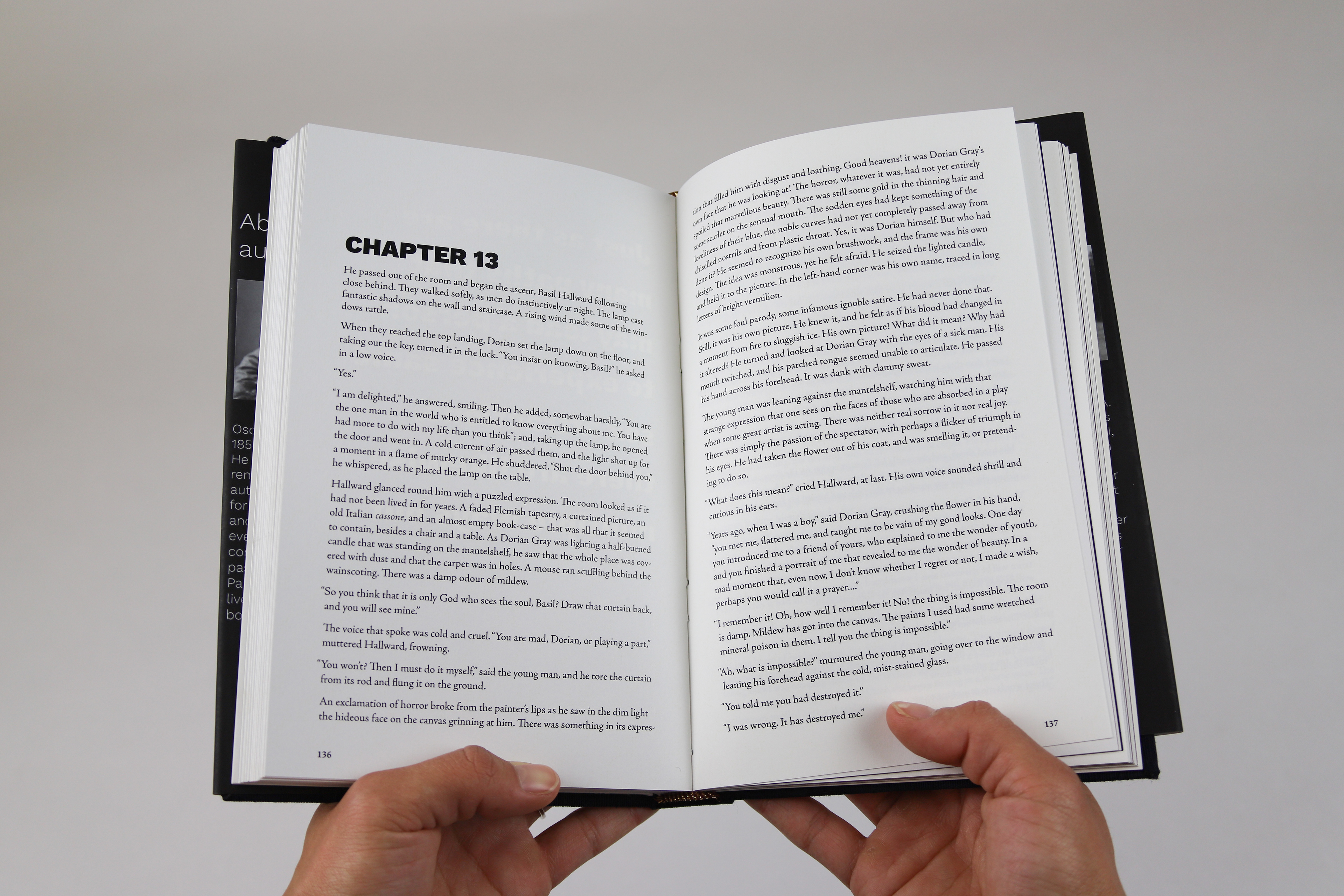
Research: After selecting the book I would be creating a new edition of, I needed to do a fair amount of research in several areas. Why was the book banned? Where and when was it banned? How does the content of the book relate to modern issues? When was the book written, and what design elements would reflect this era? After looking into all of these questions, I found the critical answers. The Picture of Dorian Gray was published in 1890, and banned almost immediately in every single English-speaking country. It was banned because of content that was considered “vulgar”. In reality, the content in question was simply undertones of lust and interest between two male characters. This was something that I wanted to dive deeper into with my edition. I also kept in mind the era in which Wilde wrote this book, for my typeface and other elements.
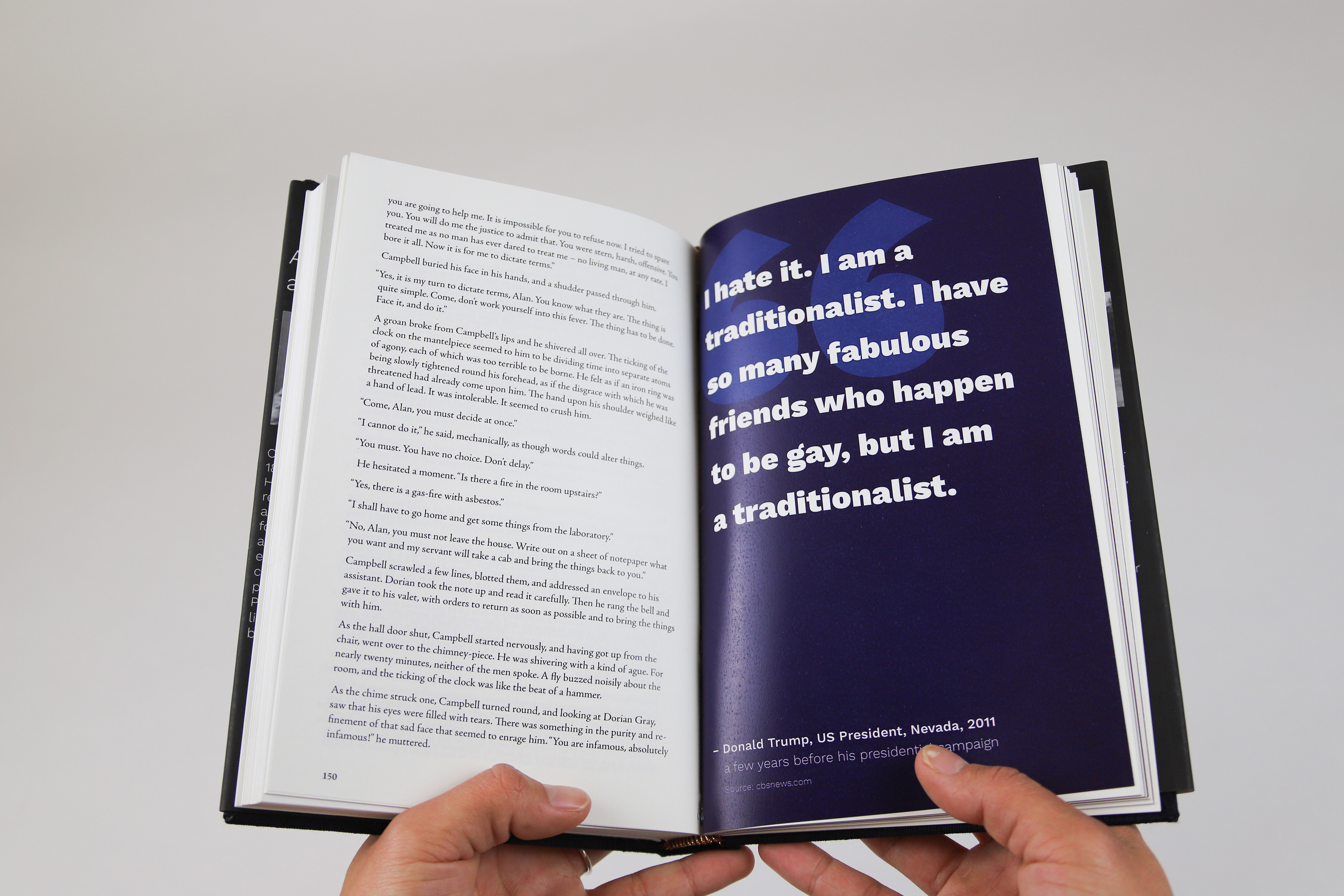
Strategy: In the initial brainstorming phase, I decided upon the core elements that my book would include. I knew that I wanted to have accent pages every few spreads that included a reference to how prevalent LGBT issues still are in today’s society, but I wasn’t sure what form these pages would take. At first, I considered including photos of protestors at pro-LGBT/anti-LGBT events, but after some consideration, I decided that direct quotes from modern-day public figures would get my point across stronger. Direct quotes cannot be twisted, and having quotes from people of power (politicians, celebrities, etc.) would clearly show how dangerous and hateful society can be for those in the LGBT community.
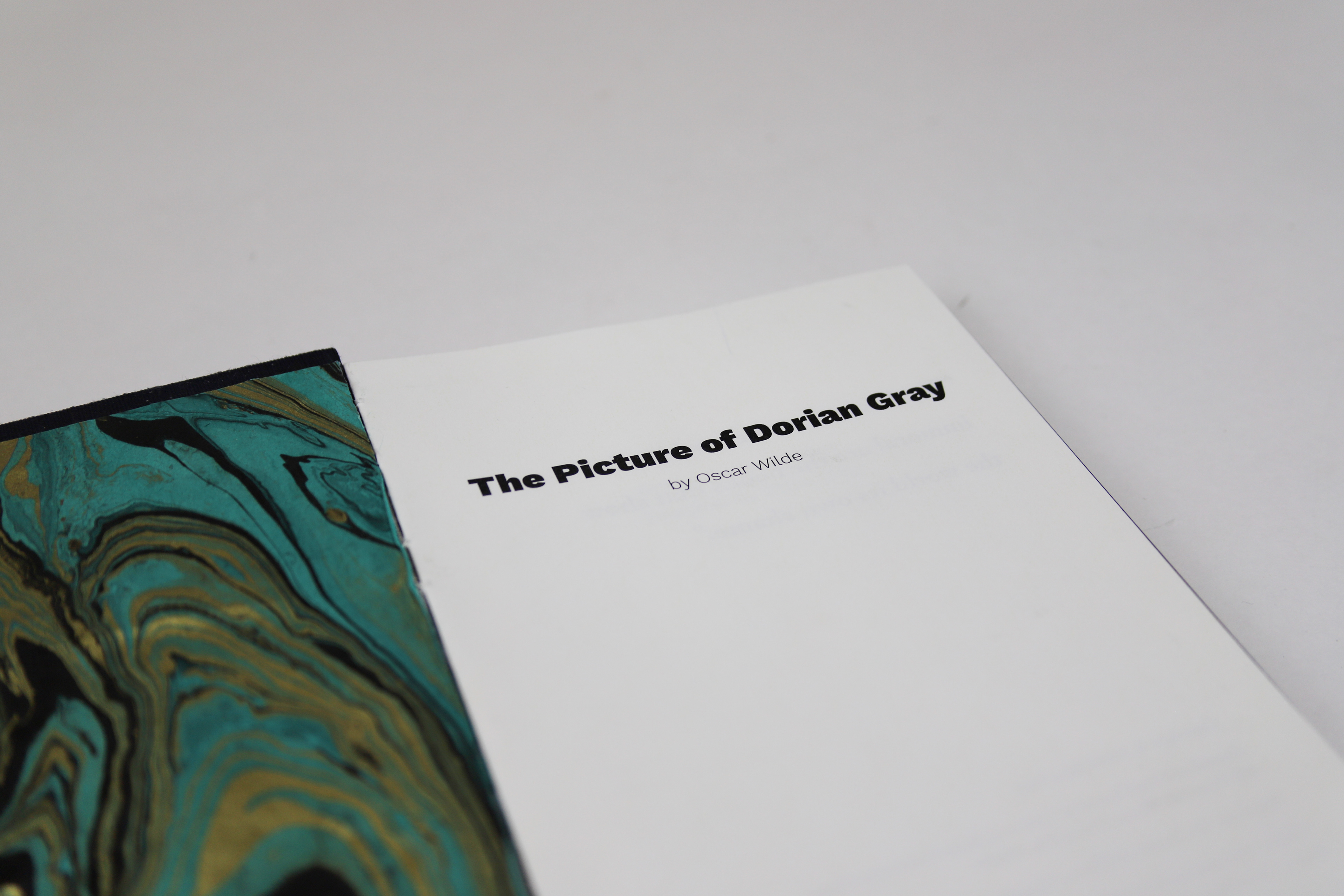
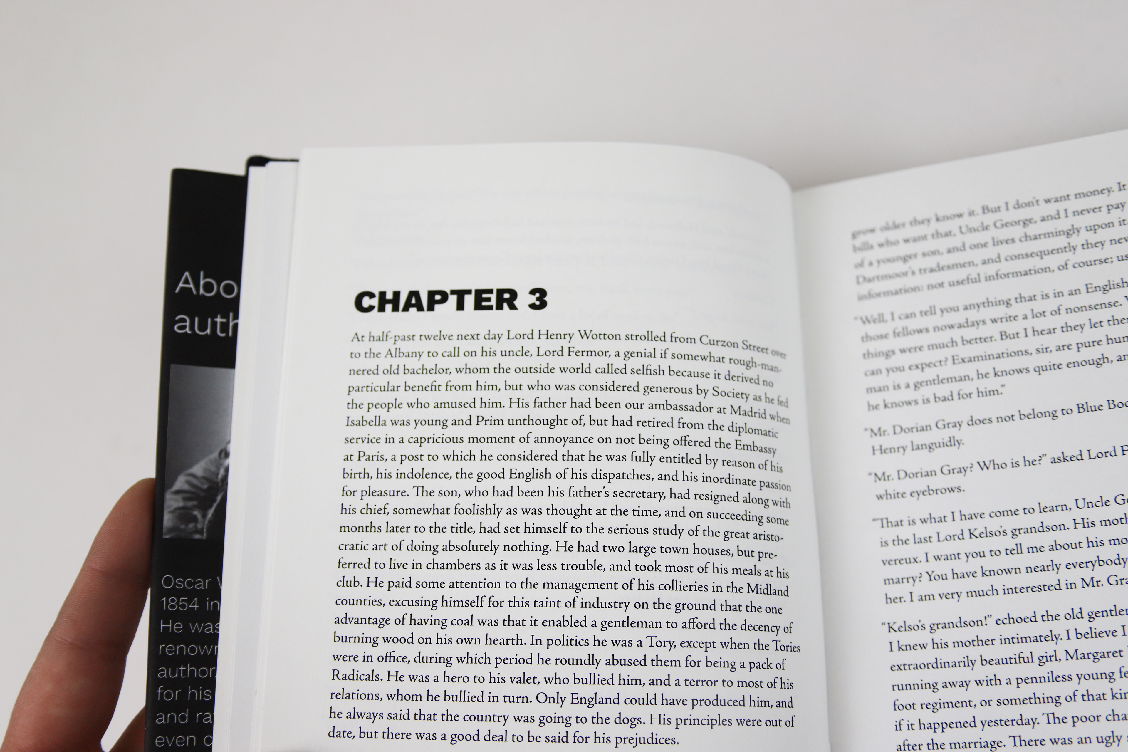
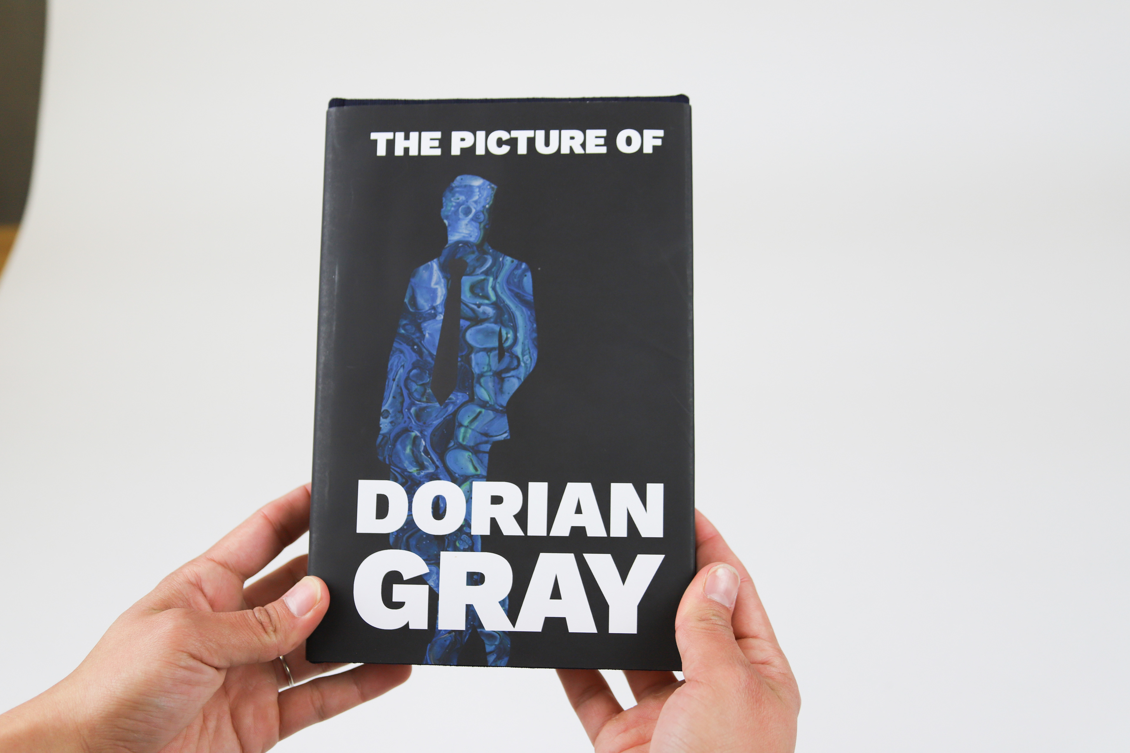
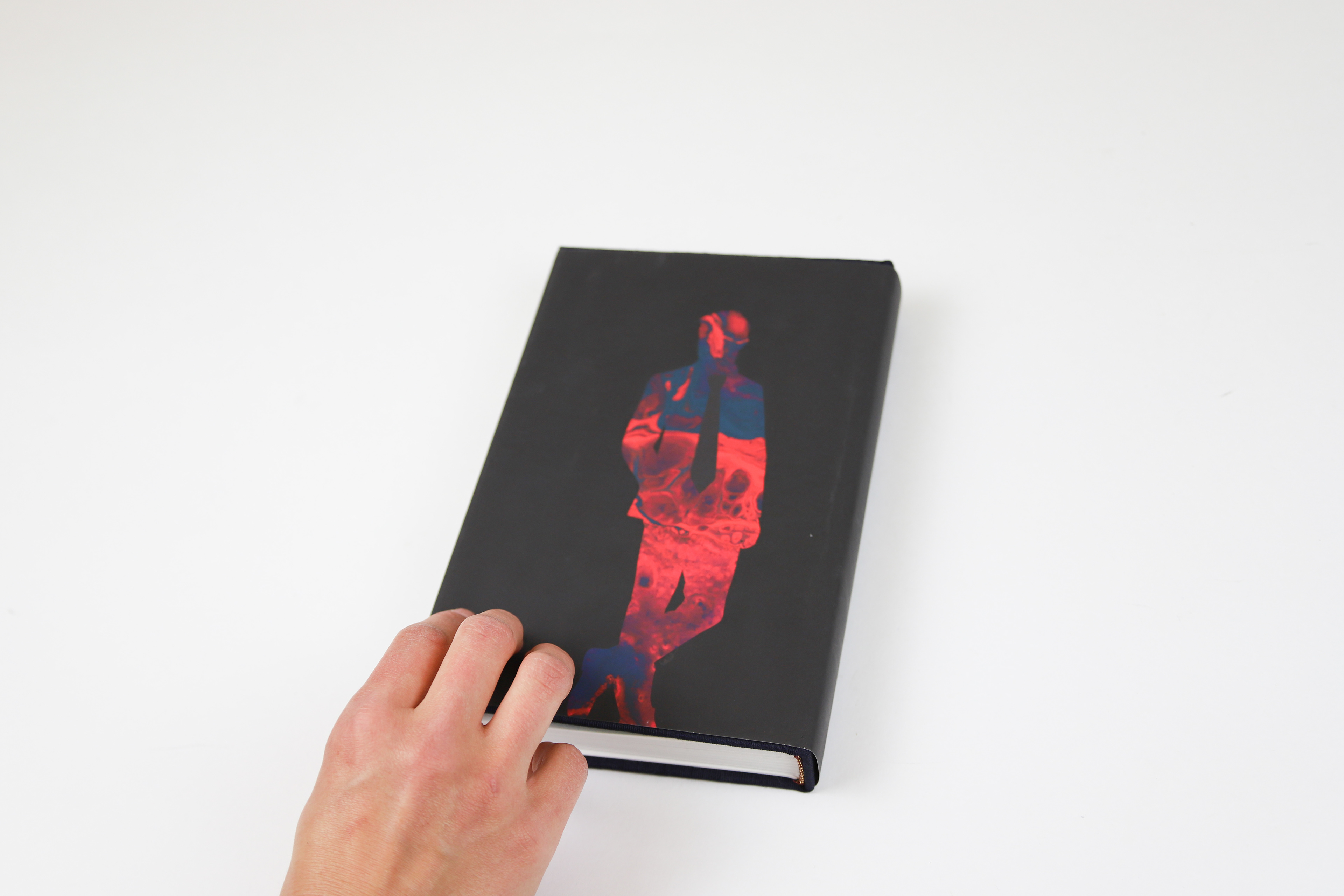
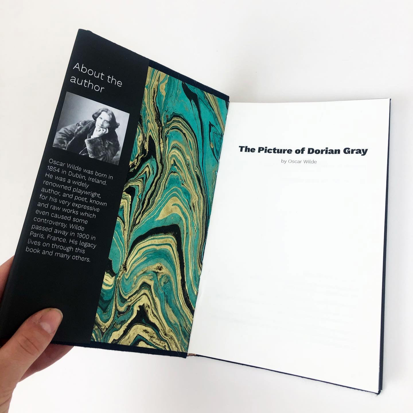
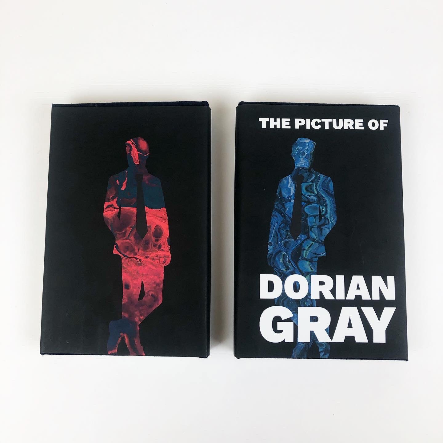
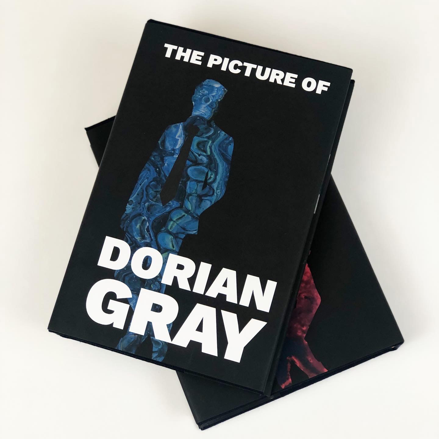
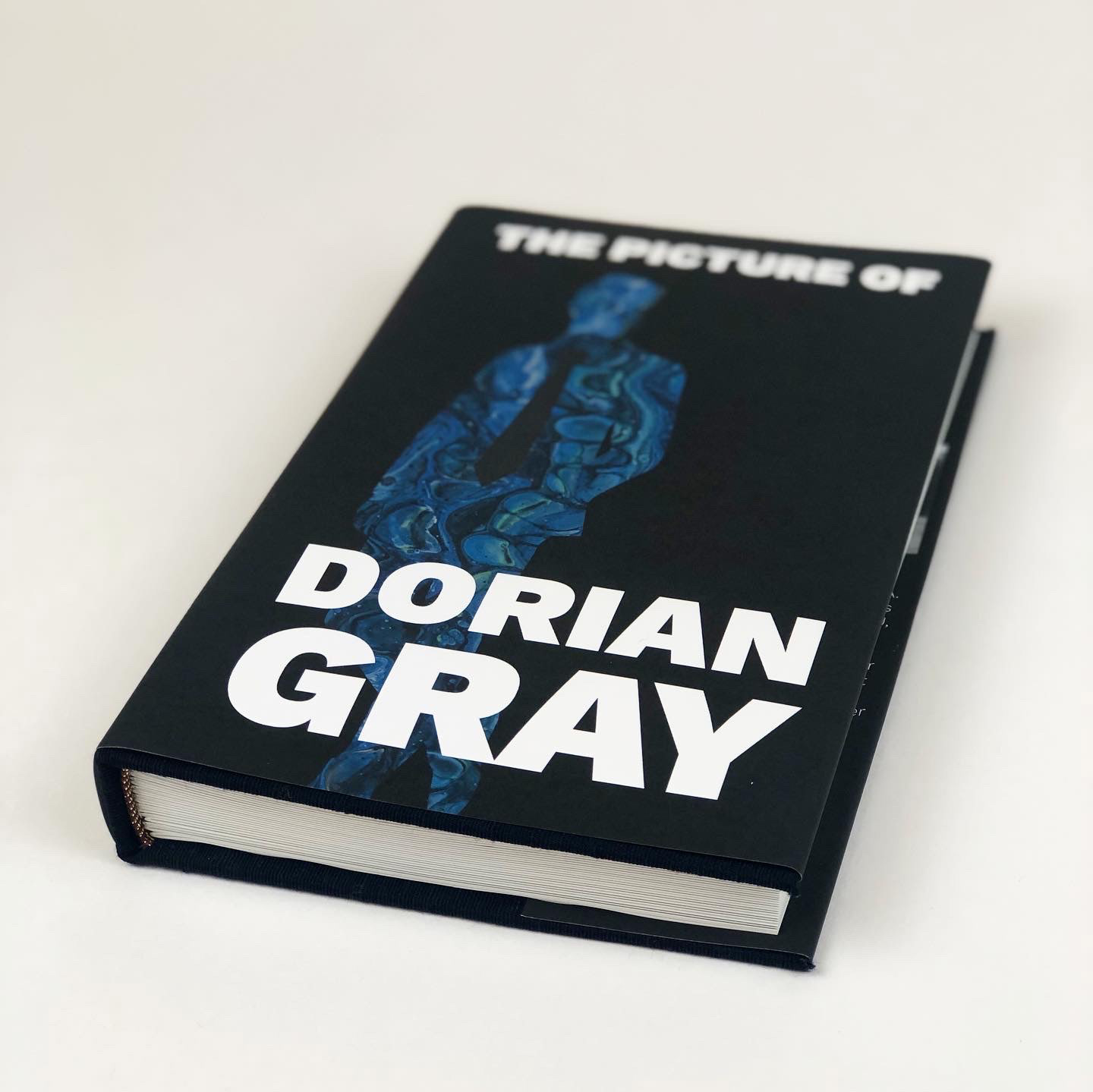
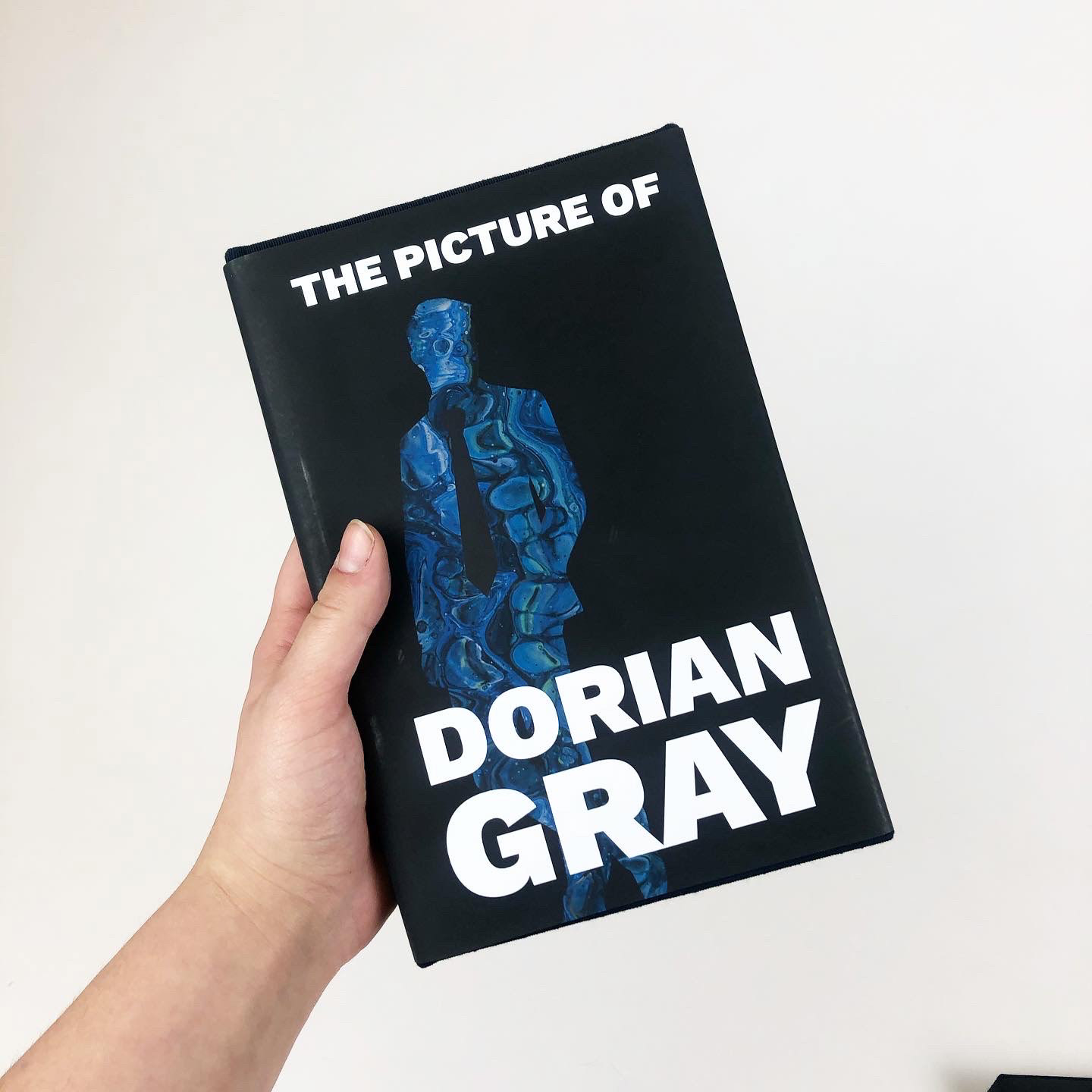
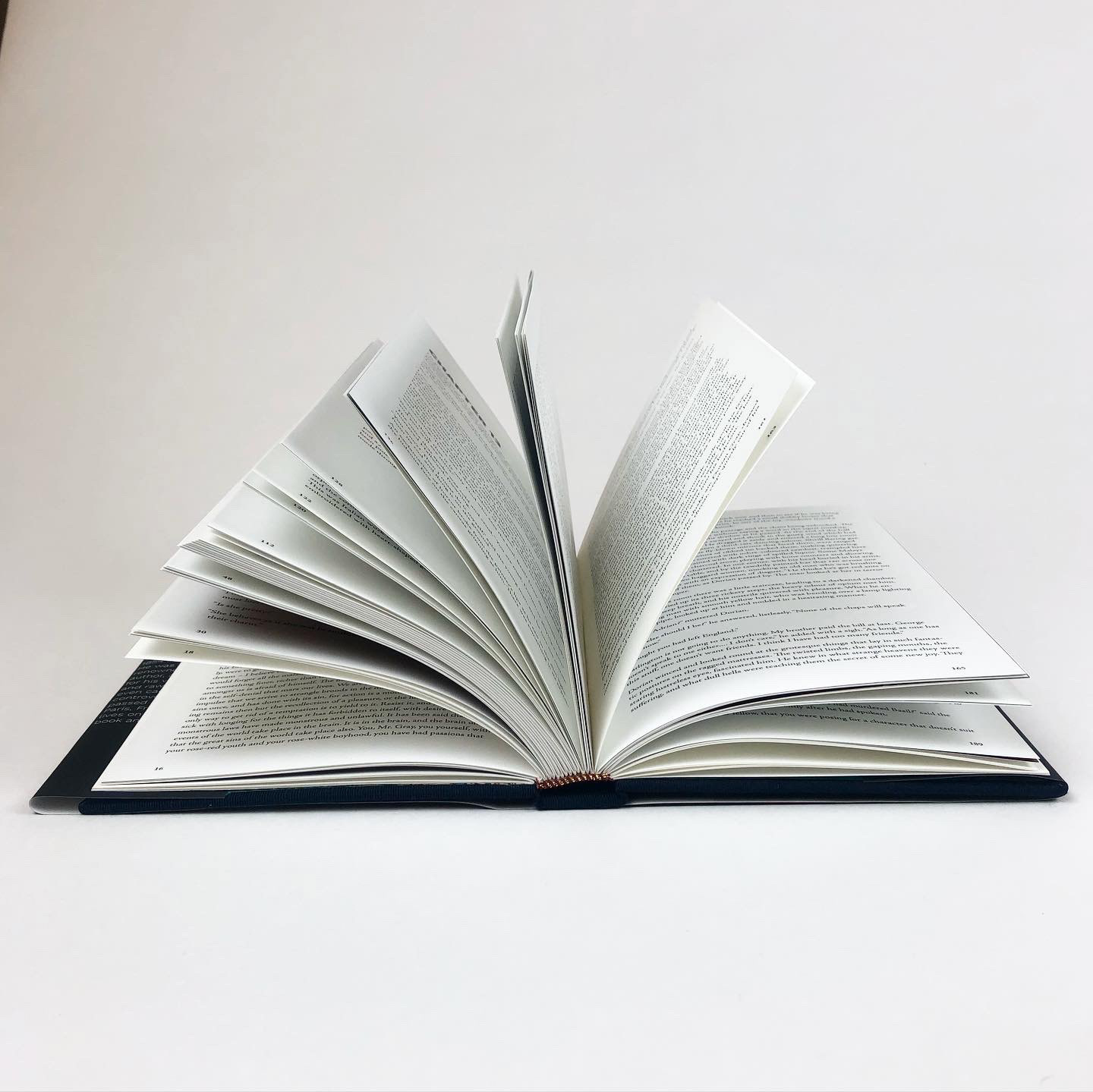
Design Solution: Following this idea, I decided to include accent pages with direct quotes from public figures every few spreads. I made these pages modern, colorful, and bold, to make them impactful and contrasting to the rest of the book – which I made very simple and historically appropriate. I used Adobe Jenson (a re-released version of Jenson, a typeface created in 1475) for the book’s text, so that it would have a timeless and oldstyle feel. For the quote pages, I used Work Sans, a modern and bold typeface that would easily convey the difference in these two eras. For the cover of my book, I went with a black background and a colorful but vague male figure on both the front and back. For this figure, I chose blue and red designs that correlated nicely with the colors of my quotes pages. One of the final design decisions was that of endpapers – for this, I decided on a teal and gold watercolor design that added elegance and motion to my book.
Challenges: This project was definitely challenging, and brought many new lessons and skills my way. From finding a banned book to use and converting the text into a version that could be easily typeset into my book’s file, to the entire hand binding process, I learned more from this project than most others. However, I truly enjoyed the entire process and sincerely hope that I can design and bind another book in the near future.